News forex gold

Pages

Wednesday, March 16, 2016

Inflation is alive and well

I suspect a good many people would be surprised to learn that, if you abstract from volatile energy prices, consumer price inflation in the U.S. has been running at an annualized rate of 2.0% for the past 10 and 20 years. In fact, the CPI ex-energy is up 2.1% in the 12 months ended February and it has even risen at a 2.3% annualized rate over the past six months and 2.5% over the past three months. Inflation is far from dead, and the deflation concerns you've heard about in recent years are all the by-product of collapsing energy prices, which, by the way, are now a thing of the past.

The FOMC undoubtedly will take note of this fact in their deliberations today, and it will encourage them to move—albeit slowly—to raise short-term interest rates to a higher level. This should not be surprising nor scary. On the contrary, it would be scary if they ignored the behavior of core inflation.


The chart above shows the year over year change in the CPI (total) and the CPI ex-energy. Note how much more volatile the total is compared to the ex-energy version. Note also how the most recent period, during which oil prices have collapsed—is similar to the 1986-87 period, when oil prices fell about as much in percentage terms as they have in the past 22 months. In both periods, the total CPI suffered a significant decline followed by a significant rebound, while the ex-energy version was relatively unchanged. There is every reason to believe that the headline (total) CPI will register 2% year over year growth (if not more) within the foreseeable future, since oil prices are no longer declining and have even rebounded some 40% in the past month or so.

The Fed's preferred measure of inflation, the Core Personal Consumption Deflator rose 1.7% in the 12 months ended January, and it is likely to post a slightly higher rate of growth in February. This is entirely consistent with the behavior of the CPI, since the PCE deflator tends to register about 30-40 bps less than the CPI. What this means is that the Fed's preferred inflation gauge will soon be very close to the top end of its 1-2% target range.

Memo to FOMC: Raising short-term interest rates to 0.75% in the next few months—thus leaving real short-term rates still deep in negative territory—would not only be fully justified, it might even be too little too late.
إقرأ المزيد Résuméabuiyad

Friday, March 11, 2016

The deflation/recession threat recedes

Exactly one month ago, many thought the world was about to tumble into a deflationary abyss.

Oil prices had collapsed to $26/bbl, high-yield spreads had soared to almost 900 bps, HY energy spreads were within inches of hitting 2000 bps, 5-yr inflation expectations had fallen to 1.0%, the Vix index was approaching 30, 10-yr Treasury yields had plunged to 1.66%, and the S&P 500 was down 15% from its all-time high.

What a difference a month can make. Today, all of these key indicators have reversed significantly. Oil is up 45% and approaching $40/bbl, high-yield spreads are down and approaching 650 bps, 5-yr inflation expectations are back up to 1.5%, the Vix index is down to 17, 10-yr Treasury yields are just shy of 2%, and the S&P 500 is only down 5% from its all-time high.

I note that one key indicator hasn't changed at all in the past month: 2-yr swap spreads remain very low (5-6 bps). As I've said numerous times in recent years, swap spreads are excellent coincident and leading indicators of financial market health. Very low swap spreads tell us that liquidity is abundant and systemic risk is low. Low swap spreads mean the underlying mechanisms of the financial markets are working just fine, allowing the market to spread risk from those who cannot bear it to those who can. Liquid, functioning financial markets are key to a healthy economy, just as are free-market prices. Price signals (e.g., cheap oil) have persuaded producers to bring their production more in line with demand. Markets have short-circuited a deflationary collapse.

We're fortunate that governments haven't stepped in to try and "fix" things that weren't broken to begin with (unlike what happened in the latter half of 2008).


I also note that one month ago there were signs that indicated we weren't headed for the end of the world as we know it. Industrial commodity prices were beginning to turn up. The CRB Metals index is now almost 20% above its January lows (see chart above).

It's tempting to say that yesterday's ECB announcement (i.e., more QE) made all the difference, but I'm not convinced. The turn for the better has been underway for the past month, and maybe the ECB announcement provided an additional nudge. For what it's worth, here is a recap of what's been going on in chart form:


Above: oil prices have rebounded sharply from their Feb. 11 lows. The fact that the active rig count in the U.S. has collapsed by 75% in the past 15 months is an excellent sign that producers have cut back production. Meanwhile, oil demand is up around the world.


High-yield Credit Default Swap spreads have tumbled, as higher commodity prices reduce the risk of corporate debt defaults.


The 5-yr expected rate of inflation embedded in the prices of 5-yr TIPS and 5-yr Treasuries has surged from 1.0% a month ago to almost 1.5% today, as higher oil prices mean that the headline CPI is likely to be much higher than the market feared. 


One more installment in the Walls of Worry chart that I've been featuring periodically. Fears are receding, and the prices of risk assets are rising. It's the same pattern we've seen repeated numerous times in recent years.


Good as all this has been, we're not out of the woods yet. As the chart above shows, the prices of gold and 5-yr TIPS are still relatively high, which means the market is still willing to pay up for the protection these unique assets offer. Gold rose to almost $1250/oz on Feb. 11, and today it is a bit higher at $1260. The real yield on 5-yr TIPS fell to 0.1% on Feb. 11, and today they are a bit lower still (the chart uses the inverse of real yields as a proxy for TIPS prices). You might not see it in the headlines, but elevated gold and TIPS prices tell us that the market is worried about the future direction of inflation being up instead of down. With a strong bounce in commodity markets occurring at the same time that major central banks have their policy pedals to the metal, it's not impossible that we could see inflation rising above target before too long.
إقرأ المزيد Résuméabuiyad

The U.S. is richer than ever

Yesterday the Fed released its estimate of the balance sheet of U.S. households as of the end of last year. Collectively, our net worth reached a new high in nominal, real, and per capita terms. We can complain all day about the fact that we are living in the weakest recovery ever, and things could and should be a lot better, but it is still the case that today we are better off than ever before. (The stock market has recovered virtually all of its losses year to date, so the significance of the numbers you see here hasn't changed.)


As of Dec. 31, 2015, the net worth of U.S. households (including that of Non-Profit Organizations, which presumably exist for the benefit of all) reached a staggering $86.7 trillion. To put that in perspective, it's about one-third more than the value of all global equity markets, which were worth $64.6 trillion at the end of last year according to Bloomberg.


On a real, per capita basis, the net worth of the average person living in the U.S. reached a record $270,000. This measure of wealth has been rising, on average, about 2.4% per year since records were first kept beginning in 1951. There's nothing unusual going on: life in the U.S. has been getting better and better for generations. If you're hungry for more details of the steady march of progress, check out Human Progress, a worthwhile project of Cato, my favorite think-tank.

And even if it were the case that the entirety of the value of stocks, bonds, deposits and real estate included in these statistics were owned by a handful of people, we all enjoy their benefits. These assets are what provide jobs and the wherewithal to run and maintain our economy.


This ongoing accumulation of wealth is not a house of cards built on a bulging debt bubble either, regardless of what you might hear from the scaremongers. On the contrary, the typical household has undergone a significant deleveraging since the onset of the Great Recession in 2008. Household liabilities today are the same as they were in early 2008 (about $14.5 trillion), but financial assets have increased by one-third, thanks to significant gains in savings deposits, bonds, and equities. Since early 2008, the value of households' real estate holdings has increased by a relatively modest 8%.
إقرأ المزيد Résuméabuiyad

Friday, March 4, 2016

Stronger commodity prices trump stable jobs growth

The February jobs report was good (beating expectations plus upward revisions to prior months), but it only marked a continuation of the moderate 2 - 2½% growth trend that has been in place for the past 6-7 years. More impressive, however, is the emerging rally in the commodity markets and, by extension, the emerging market economies. It's looking more and more like the the threat posed by the China slowdown, plunging oil prices and soaring credit spreads is fading away. In its place global growth is likely stabilizing as commodity prices firm up. Against this backdrop, central banks, the majority of which are still deathly afraid of recession and deflation, seem out of step. I think that's why gold has done so well of late: markets are sensing that monetary policy may now be too easy and therefore inflation is more likely to rise than fall. Think of gold as an early-warning indicator of the direction of future inflation. Not always right, of course, but worth paying attention to.


Private sector jobs, the ones that count, have been growing at a fairly steady pace of 2 to 2½% for just over 5 years. This, added to weak productivity of less than 1% per year, is going to give us something in the neighborhood of 2.5% real growth this year. All the monetary "stimulus" in the world is not going to change the fact that this remains the weakest recovery ever. What needs to change is fiscal policy, and that won't change meaningfully until next year, provided we have a new president who understands that the private sector needs better incentives if it is to work and invest more. 


One thing does appear to be changing, however. Labor force growth has been tepid since 2008; the number of people either working or willing to work has been growing at an annualized rate of only 0.4% for the past seven years, until recently. Over the past six months, the labor force grew at an annualized rate of 2.3%. This equates to some stirrings of life in an otherwise sleepy economy. 


As a result, the labor force participation rate looks to have bottomed. It's too early to get excited, however, since new entrants to the labor force don't appear to be fighting for top-paying jobs. But it is an important change on the margin which bodes well for the future, and that's a good reason to remain optimistic.


What's changing today is the outlook for commodity prices. After falling from 2011 through the end of last year, they are turning up. Gold prices are up 20% in just over two months. Industrial scrap metal prices are up 10% since mid-January.


And one of the most important commodities (crude oil, see chart above) is up 37% in just under one month. What this means at the very least is that market forces—prices—have brought commodity supplies back into line with commodity demand. And it's not too hard to imagine that as supplies have been reduced, demand has picked up. Rising commodity prices probably signify that the fundamentals of the global economy are improving on the margin, and that is very good news.


One example: vehicle miles driven last year were up 5% from mid-2014, which is when oil prices started to plunge (see chart above).


After falling 80% from early 2011 through January of this year, Brazil's stock market is up a staggering 45% in dollar terms, thanks to the confluence of stronger commodity prices and promises of a badly-needed change in government. Mexico's stock market is up 15%, and Australia's stock market is up 14% over the same period.


In this last chart we see that gold has shrugged off its 4-year losing streak, jumping 20% since mid-December. TIPS prices have jumped too, as have 5-yr breakeven spreads, which are up from 1.0% a month ago to 1.45% today.

Deflation? That's yesterday's news. Today markets are beginning to worry that inflation might be on the rise while central banks still have their policy pedals to the metal.
إقرأ المزيد Résuméabuiyad

Thursday, March 3, 2016

Progress report on climbing

The main concern that markets are grappling with these days is the possibility that weakness in China and in the oil patch, coupled with escalating debt defaults, could conspire to produce another recession in the U.S. I've argued that these fears are probably overblown, that the U.S. economy is inherently resilient, that most of the damage so far has been contained to the oil patch, that financial markets are fundamentally healthy, and that therefore all it takes to alleviate the market's concerns is the absence of recession, which is the most likely outcome in any event. I don't expect strong growth, merely a continuation of the modest 2 - 2½% growth we've seen for the past 6-7 years. Here are a few charts which document the progress towards climbing the latest wall of worry:


As the chart above shows, the price of oil has jumped by one-third in the past three weeks. This takes a lot of pressure off the oil patch.


Higher oil prices have helped spreads on HY energy debt to narrow by almost 500 bps! This is a clear sign that panic is receding. 


A major contributing factor to the bounce in oil prices is the huge drop in the number of active drilling rigs in the U.S., which has plunged by 75% in the past 14 months. The cure for low oil prices is low oil prices, which have sent the message to producers to shut down production and exploration.


This same dynamic (supply and demand coming into balance) is playing out in the metals markets. The CRB Metals index (see above chart) is up 10% in the past two months. This suggests that the Chinese and global economies are not going down a black hole. Producers are cutting back and consumers are ramping up demand in response to lower prices. Markets work!


The service sector is also not going down a black hole. Although the readings from the ISM surveys show the service sector is relatively weak, it is still growing. The Business Activity index, shown above, bounced quite a bit from its January low, which suggests that sentiment (e.g., everyone's worried these days, but the worry index is going down of late) could be playing a role in the relatively weak readings. It's also the case that most of the weakness can be traced to the energy sector, which contributed an additional 25K layoffs last month, according to the Challenger survey of announced corporate layoffs.


Weekly claims for unemployment have probably fallen as much as they are going to. The recent uptick is minor, and likely reflects a final round of energy-sector layoffs. 


The ADP estimate of February private sector payrolls (blue line in the chart above) suggests that jobs growth continues at the rate which has prevailed for the past several years. No deterioration, no improvement. Steady as she goes may be boring, but it is good news when the market is worried about a recession.


 With the news coming in better than feared, the market has managed to rally.


But as the chart above suggests, there is still a lot of concern out there. Gold and TIPS prices have jumped as the world worries that central banks will try once more to goose their economies with more QE and negative interest rates.


With the bounce in oil prices, we've also seen a bounce in inflation expectations. Breakeven spreads on 5-yr TIPS have jumped almost 45 bps in the past three weeks. Now at 1.44%, they are a bit below their long-term average of 1.9%, but not seriously below. In essence, the threat of deflation has almost gone up in smoke, according to the bond market.
إقرأ المزيد Résuméabuiyad

Monday, February 29, 2016

A review of key charts: no recession, no deflation, lots of pessimism

Time for a review of some key charts that I'm following. On balance, I see evidence that inflation is running about 1 ½% to 2%, as it has for the past 15 years or so. I find very little, if any, evidence that monetary policy is too tight or that deflation is likely or a real threat. This suggests that the market is overly concerned about the Fed "running out of ammunition," and overly concerned about the risk of a "downward spiral" that might be sparked by an outbreak of deflation (i.e., people stop spending because money acquires more value with time). It all but rules out the need for negative interest rates, which could be potentially dangerous since their purpose is to destroy the demand for money, and it suggests that the Fed was justified in making a modest increase in short-term interest rates. I also see reasons to think the market may be too pessimistic about the outlook for economic growth. 


The Consumer Price Index and the Personal Consumption Expenditures Deflator (above charts) tend to track each other, with the CPI running about 30-50 bps higher the the PCE deflator due to differences in the basket of goods and services measured by each. In the past year or so, both measures dipped close to zero, due mainly to collapsing oil prices, but they have recovered significantly in recent months. Meanwhile, the core and ex-energy versions of both have been relatively stable: the CPI ex-energy is up 2% in the year ending January '16, and the core PCE deflator is up 1.7% over the same period. Both have accelerated a bit of late, which runs counter to the prevailing notion that inflation is dead. With oil prices stabilizing, it's therefore quite likely that the headline CPI will hit 2% within a few months, and the PCE deflator will be close behind. In the world of macroeconomics, this is as close to the Fed's target of 2% on the PCE deflator as one could hope for, and there is no reason for a shortfall of even ½ % to be of concern. Arguably, the ideal rate of inflation would be 0-1%, but I'd be happy with 1 ½%.


As the chart above suggests, one important source of low inflation over the past 15 years has been declining prices for durable goods (e.g., computers, electronic gadgets, appliances). Durable goods prices on average have fallen by one-third since 1995. At the same time, the prices of "services" (which are mostly driven by the cost of labor) have increase by more than two-thirds. Thus, the deflation of durable goods prices means that an hour's worth of labor buys two and a half times more durable goods today than it did in 1995. 

The source of this "deflation" can be traced rather easily to China, which became a significant exporter of cheap durable goods beginning in 1995. (Durable goods prices never experienced a sustained period of decline prior to 1995, by the way.) The collapse of energy prices in the past year or two shows up in flat to declining prices of non-durable goods, which have depressed inflation of late.

It's a mystery to me why folks like Donald Trump say that China has been stealing our jobs, when thanks to cheap Chinese goods the purchasing power of the entire country has increased significantly.

So: is inflation low because the Fed been too tight? I think not. Inflation has been low mainly because of supply shocks: China's export boom, and fracking technology which has significantly boosted oil production, which in turn has resulted in collapsing oil prices.


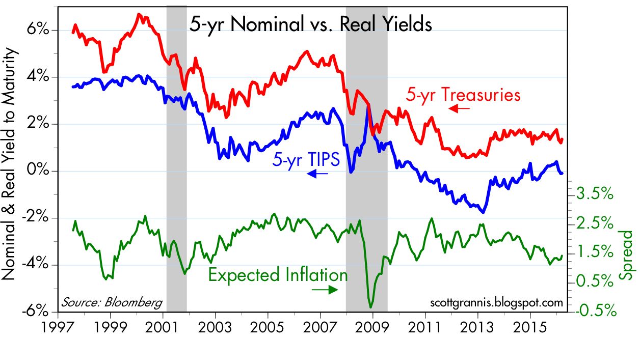
The chart above shows the market's expectation for the average annual inflation rate over the next five years (green line), as derived from the yields on 5-yr Treasuries and 5-yr TIPS. Currently 1.32%, expected inflation is lower than the current level of core inflation, and lower than the 2% average inflation rate of the past 15 years. If anything, this suggests the market may be underestimating inflation. If so, then it would stand to reason that the bond market is quite vulnerable to any sign of rising inflation.


With 10-yr Treasury yields currently a mere 1.73%—only 25 bps above their all-time lows of mid-2012—the bond market is priced to slow-growth, low-inflation perfection; it's vulnerable to any sign that inflation is either not falling or rising, and/or any sign that economic growth is, say, 2% or better. 


Extremely low Treasury yields are also a good sign that the market is consumed by pessimism, given that the earnings yield on equities is 5.7%. Choosing 10-yr Treasuries with a yield of only 1.7% in lieu of equities yielding 400 bps more (and considering further that equities have far more upside potential than bonds at this point) only makes sense if one is convinced that earnings will suffer significantly in the years to come. So far, earnings are down only a little more than 2% in the past 12 months, and most of that is coming from the oil patch. Put another way, the current PE ratio of the S&P 500 is 17.4, whereas the PE ratio of the 10-yr Treasury is 58! To pay so much for the presumed safety of Treasuries is to have truly dismal expectations for economic growth and corporate profits.


About 10 years ago I put together the chart above in order to illustrate how tight money (as reflected in rising real short-term interest rates) and high and rising oil prices conspired to trigger the recessions of 1990-91 and 2001. (As I described it then, the economy gets "squeezed" by expensive money and expensive energy, as illustrated by the blue and red lines converging.) The same thing happened with the recession of 2008-9, as oil prices reached record-high levels and the Fed raised the real Fed funds rate (its primary policy tool) to over 3%. If tight money and expensive oil have traditionally been bad for the economy, then today's negative real rates and cheap oil prices are likely a godsend. This suggests that the economy can do better than the market expects, even if it only continues to grow at 2 -2 ½%, as it has since 2009. 


The chart above illustrates how Fed tightening has preceded every recession since the late 1950s. Recessions have always followed the confluence of high and rising real interest rates (the blue line) and flat to inverted yield curves (the red line). Today, real rates are still negative and the yield curve is still positively-sloped. Monetary policy thus appears to pose no threat to economic growth, at least as far as the bond market is concerned. Otherwise the curve would be flat in the expectation that a recession would make it impossible for the Fed to ever raise rates from their current level.


This recovery continues to be the weakest in modern times. As I pointed out a few weeks ago, the main culprit is extremely weak productivity gains. As the chart above shows, real disposable personal income would be about $1.5 trillion per year higher today if this had been a typical recovery. That's a lot of income left on the table, and it explains why the middle class is not happy with the current state of affairs. Trillions of dollars of prosperity are riding on the results of the November elections, with only Republicans proposing policies that could change things for the better (e.g., reduced marginal tax rates, tax code simplification, reduced regulatory burdens).


Corporate credit spreads are elevated, and that is a legitimate source of concern (see charts above). But most of the problems with default risk are found in the oil patch. Ex-energy, high-yield bond spreads today are still less than what we saw during the PIIGS crisis of 2011, and far less than the spreads we saw in the 2008 financial crisis. So it looks like the problems in the oil patch are relatively contained. And with oil prices having stabilized, spreads on HY energy debt have already tightened by 375 bps from their recent highs of 1,984 bps. Once again I note that swap spreads are still very low, which suggests the problems in the oil patch have not resulted in any deterioration in the economic and financial fundamentals. Systemic risk is still very low, and liquidity is abundant. Healthy financial markets are a prerequisite for managing and resolving economic dislocations. Today, the economic and financial fundamentals are significantly better than they were in 2008. Back then, the Fed was tight, and liquidity was in very short supply. It's a very different story today.


Markets are still very worried, of course, as the chart above shows. The Vix index is unusually high, the 10-yr Treasury yield is quite low, and equities are still down almost 10% from their highs of last May. The pattern in the above chart (i.e., spikes in the Vix/10-yr ratio coinciding with plunges in the S&P 500 index) has been repeated quite often in recent years, only to be resolved with higher equity prices as fears decline and confidence returns. The recent decline in the Vix/10-yr ratio is thus encouraging, as is the lack of evidence that the problems in the oil patch are spreading. Still, there are many ongoing calls for a sharply lower market and a worsening of economic conditions. But from what I see, there is no reason to panic. A simple continuation of what we've seen in recent years should be enough to support equity prices at current or higher levels. In the end, avoiding recession is all that matters, as I've been saying for the past three years.
إقرأ المزيد Résuméabuiyad

Tuesday, February 23, 2016

Strange bedfellows: Koch and Sanders

Here is a great article by Charles Koch, one of the “infamous” Koch brothers that liberals routinely demonize. Koch agrees with Sanders that Big Government has unfairly rigged the system in favor of powerful interests and against everyone else.

The senator is upset with a political and economic system that is often rigged to help the privileged few at the expense of everyone else, particularly the least advantaged. He believes that we have a two-tiered society that increasingly dooms millions of our fellow citizens to lives of poverty and hopelessness. He thinks many corporations seek and benefit from corporate welfare while ordinary citizens are denied opportunities and a level playing field.

I agree with him. 
Democrats and Republicans have too often favored policies and regulations that pick winners and losers. This helps perpetuate a cycle of control, dependency, cronyism and poverty in the United States. These are complicated issues, but it’s not enough to say that government alone is to blame. Large portions of the business community have actively pushed for these policies.
Our criminal justice system, which is in dire need of reform, is another issue where the senator share some of my concerns. Families and entire communities are being ripped apart by laws that unjustly destroy the lives of low-level and nonviolent offenders.

Today, if you’re poor and get caught possessing and selling pot, you could end up in jail. Your conviction will hold you back from many opportunities in life. However, if you are well-connected and have ample financial resources, the rules change dramatically. Where is the justice in that?

Read the whole thing. These are important issues that transcend party lines.
إقرأ المزيد Résuméabuiyad